In the world of business, making a lasting impression often starts with a simple exchange – the handing over of a business card. But what’s often overlooked in this transaction is the critical role of the font. Yes, the choice of font on a business card can speak volumes about a company’s brand, professionalism, and attention to detail.
From the timeless elegance of serif fonts to the modern simplicity of sans-serif, the font you choose can set the tone for your business relationship. It’s not just about aesthetics, it’s about communication. So, let’s delve into the world of business card fonts, exploring their impact and how to make the best choice for your brand.
Remember, your business card might be the smallest piece of marketing material you have, but it’s also your first chance to make a mark. Make it count with the right font.
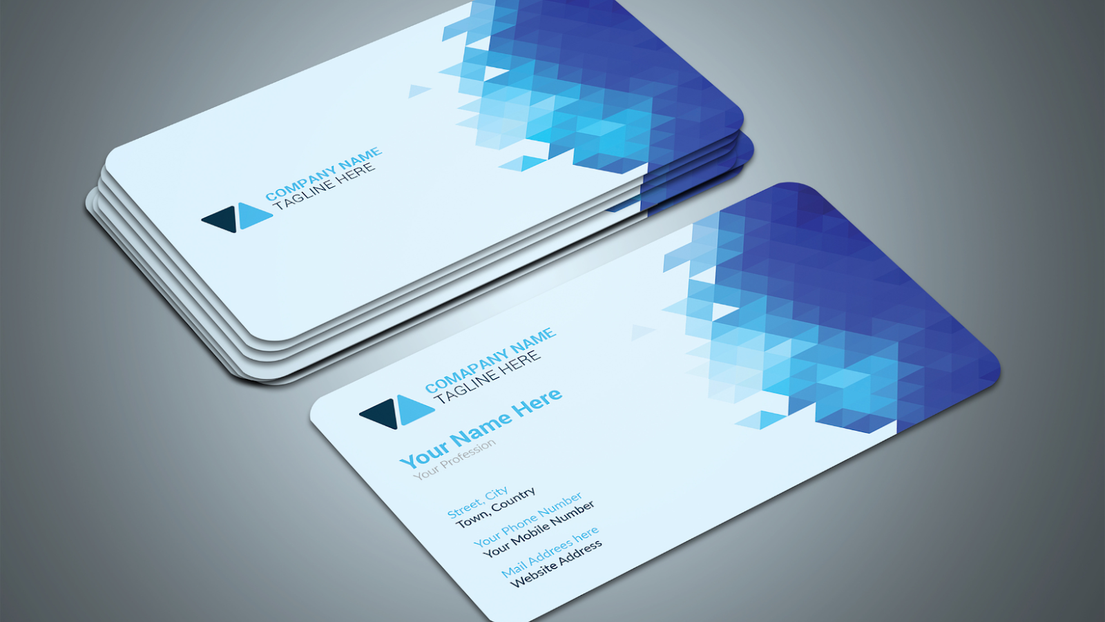
Business Card Fonts
Selecting the perfect font for your business card serves as a vital step in creating a positive first impression. It’s also an essential part of brand development and communication. Let’s dive deeper into the importance of font choice and explore popular font categories.
Font choice goes beyond mere aesthetics in a business card design. It carries the weight of a company’s reputation and serves as a reflection of its professionalism. A font can convey a distinctive personality, setting the tone for business relationships and communication. Each font selection sends a different message, illuminating part of the company’s character. For example, Serif fonts convey tradition and reliability, while Sans serif fonts often represent modernity and innovation. Thus, considering the font on a business card isn’t merely a design decision; it’s a strategic move in building a strong brand.
Each of these categories holds a plethora of fonts, each with their own personality. Selecting a fitting font from these categories can significantly enhance the impact of your business card.
Top Business Card Fonts
Decoding the art of font selections, this segment reveals noteworthy business card fonts within different categories. Each font selection resonates with a distinct identity, hence businesses ought to select judiciously.
Serif fonts, often described as traditional and respectable, set an auick-toned professional aura. Fonts, like Times New Roman and Baskerville, operate seamlessly in offering these characteristics. A closer look at Times New Roman uncovers a universally acknowledged font, credited for its versatility and ease of readability. In comparison, Baskerville flaunts an elegant personality, bringing a modern twist to vintage style, ideal for businesses seeking a refined yet retro vibe.
Sans-Serif Fonts
Sans-serif fonts offer a sleek, clean approach to typography. Helvetica and Futura exemplify this font category. Helvetica, popular for its straightforward, minimal design, creates a vibe of modern professionalism. It’s utilized extensively by corporations worldwide. Futura, on the other hand, relishes a geometrically balanced design, making it a preference for businesses looking for a typeface that highlights clarity and precision.
Design Considerations for Business Card Fonts
Selecting font carries a weight of importance that is often underestimated. The following factors play an essential role in making a formative impression and conveying the right brand personality.
In terms of business card fonts, readability holds prime importance. If the writing is distinct and clear, it is more likely to communicate effectively with the reader. For instance, the Arial font is instantly recognizable and easy to read regardless of size, making it a popular choice for business cards. Speaking of size, it’s pivotal to balance readability with style. A good measure is usually between 8-14 points— small enough to be stylish yet large enough to ensure clarity.
Brand Consistency
The selected font also needs to be in harmony with the overall design, resonating with the brand’s ethos see-through in not just the business card but other marketing collaterals too. Take, for instance, the sleek Sans Serif Myriad Pro font used by Apple. It amalgamates seamlessly with the brand’s minimalist aesthetic across various promotional mediums.